

Manage the impact of light on your life.
Speak to customers who want more comfortable days. Lead with lifestyle photography, product clarity, and quiet confidence. CTAs point to "Try Avulux Glasses" or "Shop Avulux."
A working reference for everyone shaping how Avulux shows up across consumer campaigns, the ECP portal, clinical materials, and partner collateral.
A working reference for everyone shaping how Avulux shows up in the world.
Avulux does two jobs at once. It helps people living with migraine feel understood, and it gives eye care professionals the confidence to recommend a clinically grounded lens.
This guide translates the consumer brand at avulux.com and the professional brand at ecp.avulux.com into one practical system for campaigns, presentations, provider materials, pages, and partner collateral. Two dialects of the same vocabulary, kept in tune.
One brand, two dialects. Consumer and professional share the same science, and speak different languages.
Speak to customers who want more comfortable days. Lead with lifestyle photography, product clarity, and quiet confidence. CTAs point to "Try Avulux Glasses" or "Shop Avulux."
Speak to professionals who need evidence and respect for their practice. Lead with clinical proof, patient outcomes, and partnership. CTAs point to "Become an Avulux Authorized Provider."
Whether the audience is a patient or a provider, the brand is about restoring participation in daily life. Show the human benefit before the technical detail.
Use precise language: "clinically proven," "independent studies," "light filtering." Avoid broad cure language or unsupported symptom guarantees.
Explain blue, amber, and red filtering in plain language, then connect it to the portfolio: Avulux, Avulux Adapt, and Avulux Atlas.
DTC asks people to shop, try, compare, or find a provider. ECP asks professionals to become providers, learn the science, or partner with Avulux.
These are the key messages each side leads with — the actual language, proof, and posture. DTC speaks to the person who wants their day back. ECP speaks to the professional who fits the lens. Treat the phrasing in quotes as working copy, not just direction.
| DTCConsumer | ECPProfessional | |
|---|---|---|
| Who we’re talking to | Adults living with migraine or light sensitivity who want more comfortable days — at work, on screens, under fluorescents, outside. People who’ve tried dark rooms and avoidance, and want to stay in the light instead of hiding from it. | Optometrists and ophthalmologists looking to offer patients with photophobia and migraine-related light sensitivity an evidence-based option, and to build a differentiated specialty within their practice. |
| What we promise | Manage the impact of light on your life. “Avulux lenses are designed to help you take back control of your day, so you can stay present for the moments that matter.” |
An evidence-based lens, and a specialty for your practice. “Offer patients living with migraine and light sensitivity a clinically grounded lens, backed by independent research and trusted by leading eye care professionals.” |
| How we frame the problem | “For people living with migraine, ordinary light — screens, fluorescents, sunlight, headlights — can trigger discomfort and pull you out of daily life. You shouldn’t have to dim your life because of light.” | “Photophobia affects the majority of people living with migraine. Conventional tinted lenses filter broadly, rather than targeting the specific wavelengths most associated with migraine discomfort.” |
| How we describe the lens | “Avulux filters the harmful blue, amber, and red light most likely to trigger discomfort, while allowing soothing green light through — so colors still look natural and the world still feels like the world.” | “A multi-band notch filter that selectively filters blue, amber, and red wavelengths associated with migraine, while preserving green light transmission for its soothing properties and natural color perception.” |
| How we prove it | “The only lenses clinically proven to help people living with migraine.” | “Validated in an independent, double-blind, randomized, placebo-controlled clinical trial, and recommended by leading optometrists and migraine specialists worldwide.” |
| How it should feel | “Calmer days. Fewer missed moments. The confidence to say yes to dinner, the drive home, the screen, the light-filled room.” | “The confidence of offering something more than a tinted lens — a therapeutic option backed by peer-reviewed evidence and trusted by your peers.” |
| How the portfolio shows up | Lead with the use case, not the SKU. Avulux for screens and indoor light. Adapt for inside & outside. Atlas for outdoor glare. Always Avulux. Wherever the day takes you. | Present the three lenses as one clinical system with shared science and different use cases, so providers can match the right lens to the right patient day. |
| Visual cue | Real people in real light: cooking, working, parenting, walking, hiking, driving, using screens. Soft, natural lighting. Genuine expressions. | Fittings, consultations, and patient conversations. Warm clinical environments. ECP testimonials and peer endorsements. |
| Calls to action | “Try Avulux Glasses.” · “Shop Avulux.” · “Find an Avulux provider.” · “Compare all lenses.” | “Become an Avulux Authorized Provider.” · “Learn the science.” · “Partner with Avulux.” |
| Signature words | Comfort · stay in the light · manage the impact of light · soothing green light · people living with migraine · more comfortable days · wherever the day takes you. | Clinically proven · independent, double-blind, randomized, placebo-controlled · photophobia · migraine-related light sensitivity · therapeutic eyewear · Authorized Provider. |
| What we never say | Cure · treat · prevent · FDA-cleared · miracle · sufferers · “migraines” (plural) · eliminate · zero pain · guaranteed relief. | Profit guarantees · aggressive retail framing · “easy sell” · any claim beyond the clinical evidence. |
Who we are when we're showing up at our best, and what that sounds like on the page.
Avulux was founded to give people living with migraine a way to stay in the light, not hide from it.
We earn trust twice: once from the person reaching for relief from harmful light, and again from the eye care professional who fits the lens. That means we sound clinical without being cold, warm without overselling, and specific because light is specific.
To improve the quality of life for people living with migraine and light sensitivity, through precision-engineered eyewear that effectively manages light exposure.
To be the trusted standard in therapeutic eyewear, empowering people with migraine worldwide to live fuller, more comfortable lives.
One brand, two dialects. Consumer copy acknowledges the struggle and offers practical light management. Professional copy respects expertise and proposes partnership.
We acknowledge how debilitating light sensitivity can be, and we offer practical tools to manage the impact of light. Never miracle cures, never cure-language.
We understand how debilitating light sensitivity can be. Avulux lenses are designed to help you take back control of your day.
We respect clinical expertise and the realities of running a practice. We lead with evidence, patient outcomes, and partnership.
Partner with Avulux to offer your patients an evidence-based option for photophobia and migraine-related light sensitivity.
For millions living with migraine and light sensitivity, ordinary light becomes an extraordinary burden.
We believe no one should have to dim their life because of light. That's why we made Avulux: precision-engineered eyewear designed to filter the specific wavelengths most likely to trigger discomfort, while preserving beneficial light.
Our commitment goes past the product. We're building a community of understanding, partnering with eye care professionals, and advancing the science of light management.
The cornerstone of our visual identity, used consistently across every brand touchpoint.
The Avulux logo is the cornerstone of our visual identity. Use it consistently across all brand touchpoints.
The full lockup with tagline should be used whenever possible. It represents the full brand identity.
The wordmark without tagline is used when the tagline would be redundant or space is limited.
The crown icon is a standalone brand mark for favicons, social avatars, and other small or square placements.
Full color on white
Reversed on dark
Grayscale
On brand teal
On white
On dark
On white
On dark
Maintain a minimum clear space around the logo equal to the height of the "A" in Avulux. This keeps the logo readable and uncrowded by neighboring elements.
Digital: 100 px minimum width
Print: 1 inch (25 mm) minimum width
Six common mistakes to avoid.
One master brand, two audiences, three lenses.
Four core colors anchor the brand. Two more extend the ECP palette. A product palette differentiates the lens portfolio. Click any value to copy.
The single brand color that carries across both modes. Used for CTAs, links, and highlights.
Primary text color in light mode. Primary background in dark mode. The brand's structural anchor.
Primary background in light mode. Accent and soft-text color in dark mode. Adds warmth without hue.
Secondary background in light mode. Primary text and UI in dark mode.
ECP-only accent for badges, highlights, and special callouts. Complements teal in dark mode.
Deeper background against Dark Navy. Used for elevated surfaces and cards in ECP mode.
Same palette, two dialects. DTC is light. ECP is dark. Teal is constant.
| Role | DTCLight mode | ECPDark mode |
|---|---|---|
| Primary background | Cream · #F4F2E6 | Dark Navy · #121A24 |
| Secondary background | White · #FFFFFF | Navy Light · #1E2D3D |
| Primary text | Dark Navy · #121A24 | White · #FFFFFF |
| Secondary text | Gray · #495057 | Gray · #ADB5BD |
| Accent / CTA | Teal · #3CA899 | Teal · #3CA899 |
| Logo version | Black lockup | White lockup |
Each lens in the portfolio carries a distinct core color and a matching pastel. On avulux.com, the pastel sets the card background for its product, making the lineup legible at a glance.
Indoor everyday wear. The core migraine and light sensitivity lens.
Light-reactive lens for changing light, indoor to outdoor.
Outdoor lens for high-glare contexts: water, roads, snow, hiking.
Use the pastel for backgrounds, cards, and soft fills. Reserve the core color for product-specific accents, category labels, and iconography. Pair either with Dark Navy for text.
Two typefaces carry the brand: a display serif for voice, a sans for clarity.
Photography that reinforces compassion, precision, and hope. Never staged, never clinical.
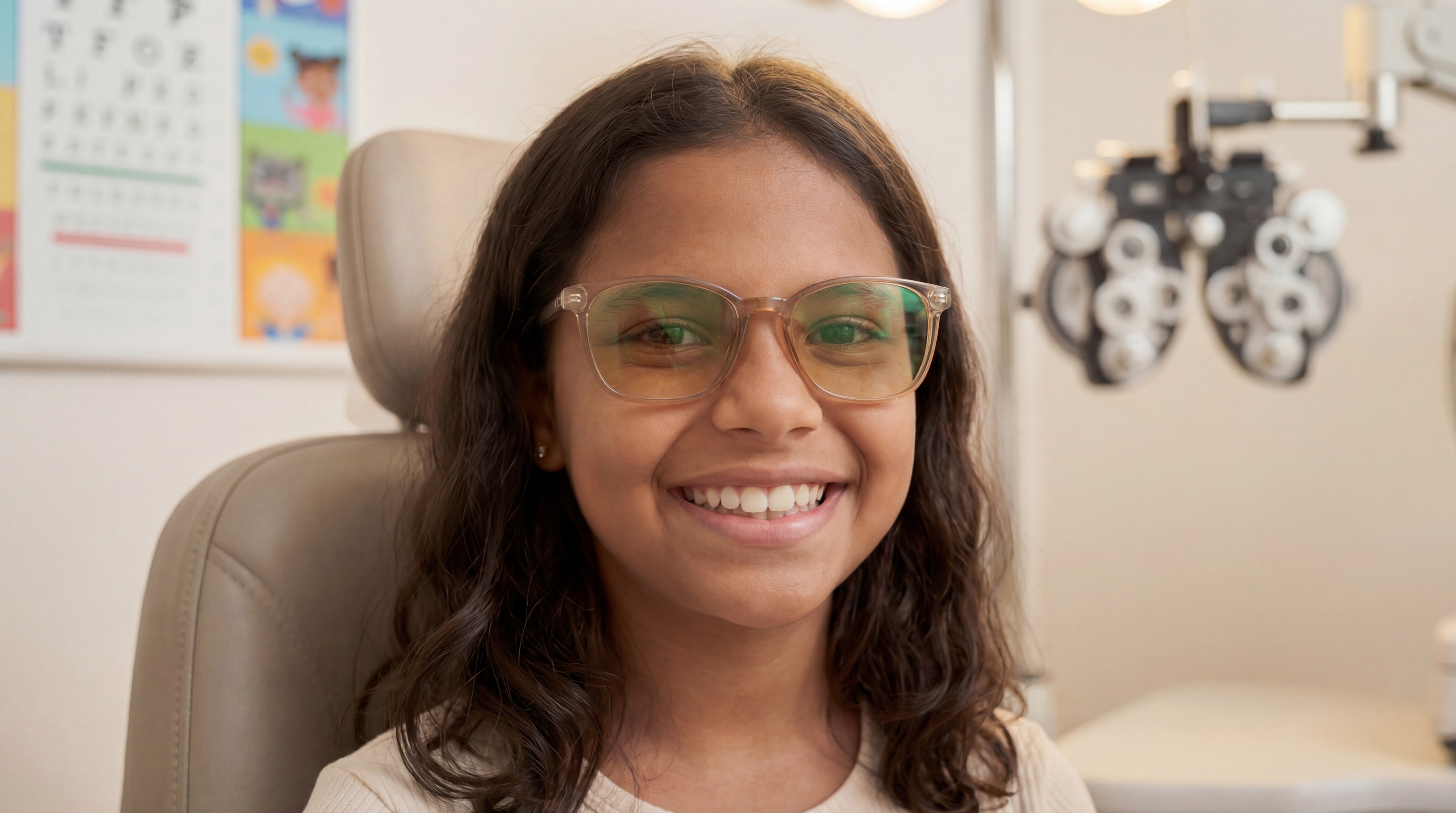
Daily life with the light turned down.


Show real people in authentic situations: moments of comfort and relief, not poses. Use natural, soft lighting. Include diverse representation across ages and contexts. Avoid anything that reads as staged or clinical.
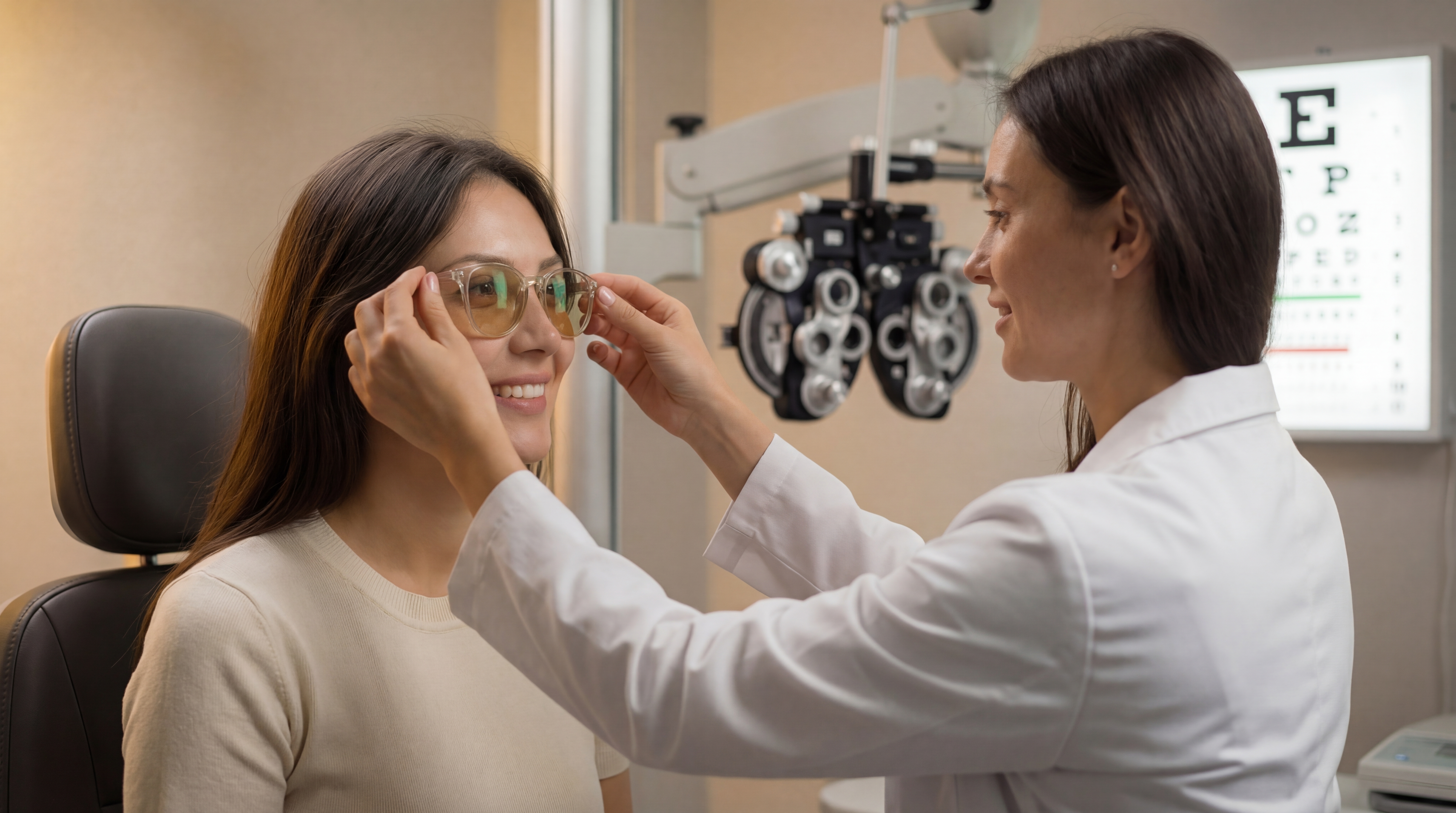
Professional environments, paired with warmth.
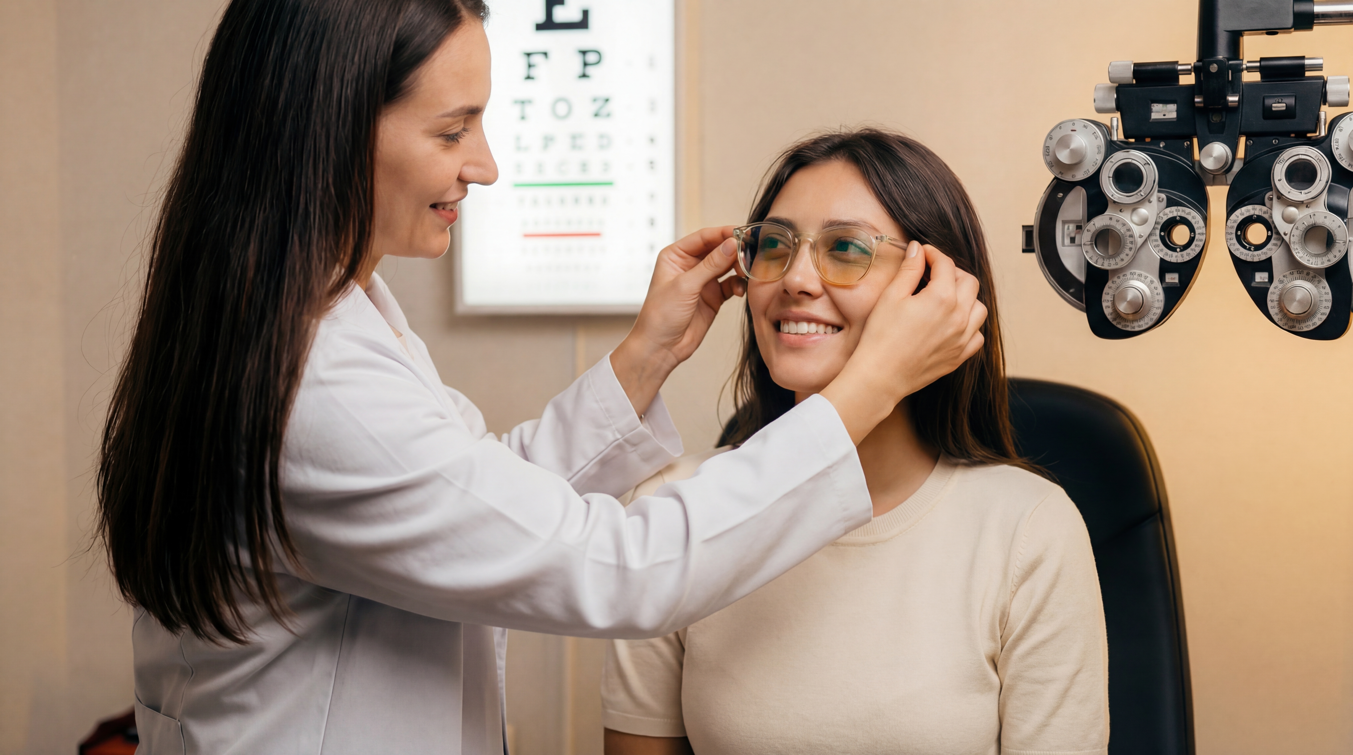
Feature eye care professionals with patients. Emphasize partnership and trust. Keep the atmosphere approachable; clinical shouldn't mean cold.
Three lenses, one science, staged by use case.


Show the portfolio as a use-case system: Avulux for indoor light, Adapt for changing light, Atlas for outdoor glare. Pair clean product shots when comparing options with lifestyle images that make the recommendation intuitive. Keep lens names locked to the master brand, and preserve the shared science story: harmful blue, amber, and red light filtered while soothing green light passes through.
Assets, formats, and resolution. Everything you need to use Avulux correctly.
All logos ship as SVG for maximum scalability.
| Use case | Resolution | Color mode |
|---|---|---|
| Digital · web | 72 DPI minimum | RGB |
| Standard print | 300 DPI | CMYK |
| Large-format print | 150 DPI minimum | CMYK |